Project Index
A Conversation with
Kristian Henson
December 23, 2020
Chris Fussner, Kristian Henson
Online
(Chris) HEY KRISTIAN, COULD YOU TELL US BRIEFLY ABOUT YOURSELF AND HOW YOU MET TFI?
I'm a designer and publisher, born/raised in Los Angeles and based in New York City since 2012. I founded the imprint Hardworking Goodlooking with Clara Balaguer in 2013. HWGL prints books/zines centered on a range of topics such as island ecology, tropical anarchism, vernacular typography, undocumented cyberpunk filmmaking, decolonization, unlearning, indigenous foodways, troll farming, and mosquito presses. All our books are printed in Manila using local printers and vendors. HWGL started as the print arm of Clara's now deceased social practice project, The Office of Culture and Design, but has since grown to be a stand-alone publishing hauz and a broader collective that includes photographer Czar Kristoff and designer Dante Carlos who have been integral collaborators since the jump.
In addition to HWGL, I run my own personal graphic design studio that works with artists, art institutions, small businesses, and the occasional large client. The studio is the space where I can incorporate my learnings from HWGL projects into more "practical applications."
In addition to HWGL, I run my own personal graphic design studio that works with artists, art institutions, small businesses, and the occasional large client. The studio is the space where I can incorporate my learnings from HWGL projects into more "practical applications."
In many ways, I like to see HWGL as a laboratory and my studio practice as a garage where I tinker around with all of the off pieces, scraps, and mistakes.
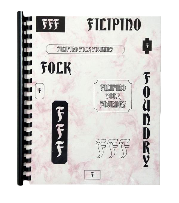
![Filipino Folk Foundry, Hardworking Goodlooking, 2014]()
I met Tropical Futures Institute in 2017(?) HWGL had a booth at the New York Art Book Fair, and Chris walked up and just left a stack of TFI stickers on our table and asked if it was ok LOL. The stickers were so bold and in your face. "Late Capitalism" and "Post Growth" were the mottos. I really liked the attitude, so I gladly accepted them. I remembered that Chris had DM'ed HWGL earlier that year in search of the Filipino Folk Foundry book. Meeting him in person for that moment at the NYABF left an impression on me. The following summer, HWGL shared a small booth at Cultural Traffic with Catalogue. Typically I like to share our table space with emerging artists or projects, so I hit up Chris, and he brought a bunch of TFI and VSOON merch. Spending that afternoon in the Lower Eastside, trying to sell zines and shirts while it drizzled, was a great moment. Since then, we have been good friends. Chris is an amazing conceptual thinker with great energy, and I'm happy that TFI has taken off. It's a platform for speculative ideas more than a brand in my mind.
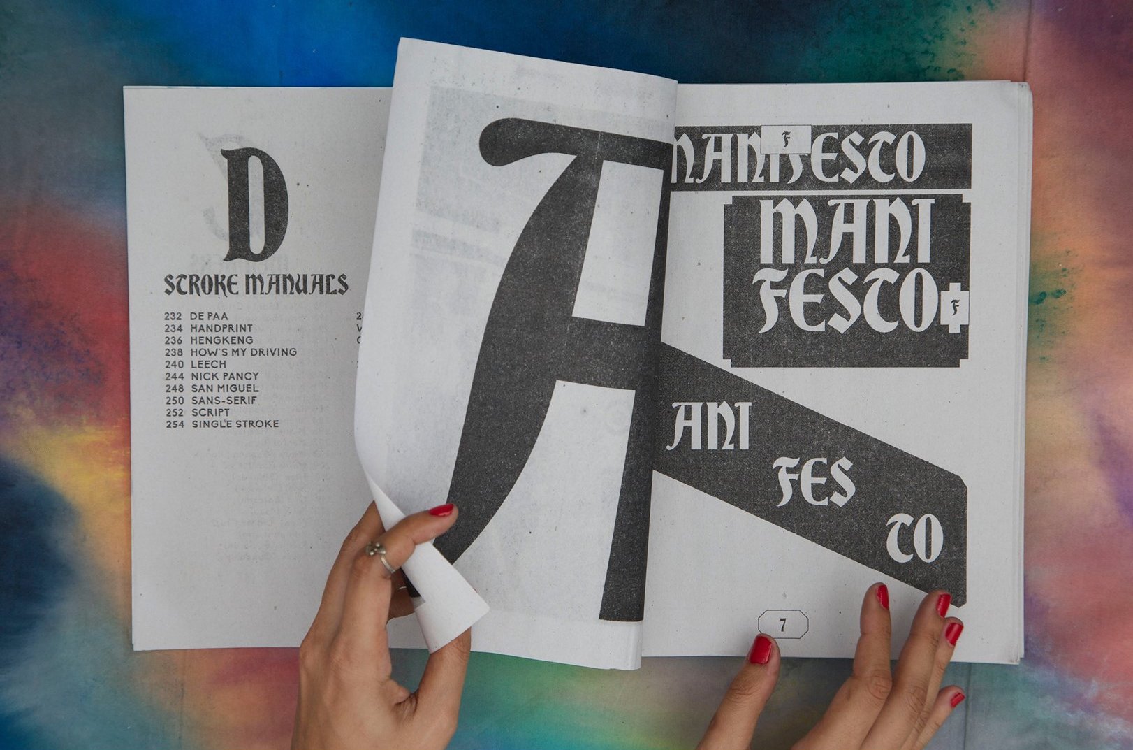
WHAT WAS THE GOAL OF FFF? WHY IS IT IMPORTANT TO TALK ABOUT IT?
Filipino Folk Foundry didn't start with any lofty ideas or big goals. Clara had known scholars studying sign-painting and vernacular design in Manila, and in collaboration with a group of field researchers who interviewed and collected data on the ground, we were able to add our own thoughts and perspective to create FFF through the writing and design of the book. At the time (2014), the decolonization of art and design was on our minds. It wasn't really an issue so widely discussed as today. We were tired of our history and theory told to us by outside sources rather than putting in the work to determine our own representation. Through this book, we were able to push back against Western ideals and process all the internalized racism Filipinos have toward local design (admit it). FFF was also an attempt to define a Filipino design sensibility on its own terms.
We wanted to look at the sign-painters eye-to-eye and
ask them the same questions we would have asked any established designer. We wanted the sign-painters to be active participants in the book rather than a transactional acquisition of their work. To take their content without mutual exchange and collaboration felt like we were acting as colonizers ourselves. The book serves as a combination of a textbook for study with a directory to contact sign painters to hire. Like all our books, we made sure to print in Manila and the translation of working with local printers, machines, paper stocks adds another layer to the project.
FFF is not perfect, nor does it speak for everyone. I'm so proud of the work we did, but I'm also fully self-critical of it. It being a first attempt at a project of this kind, it is hard to make the project equitable for everyone but something
we’re working toward. FFF did make some kind of ripple in the design community and is still sought after globally. I hope it can be seen as a template for others to do similar work. I feel content when learning it has been archived by libraries and universities to be accessible to students and scholars for a long time. I don't know how "important" it is, but I think that it is part of a larger wave of projects which are looking deeper into decolonization in our field, writing our own history, and trying to dismantle modernity. We are looking into ways to revisit the project now that it is almost 6 years old (wow).

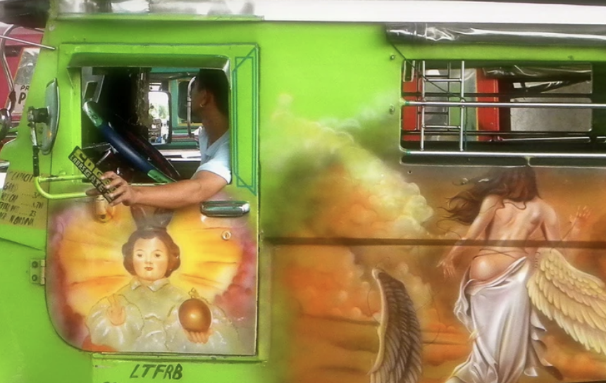
TYPEFACES LIKE THIS ARE VERY PROMINENT IN THE CLASSIC FILIPINO JEEPNEYS. IN A WAY, IT IS CONSIDERED FILIPINO DESIGN. HOW DO YOU THINK WE CAN KEEP THIS TYPE OF ART FORM ALIVE, ESPECIALLY WHEN THE TALK OF THE TOWN IS THE EVENTUAL PHASING OUT OF THESE JEEPNEYS?
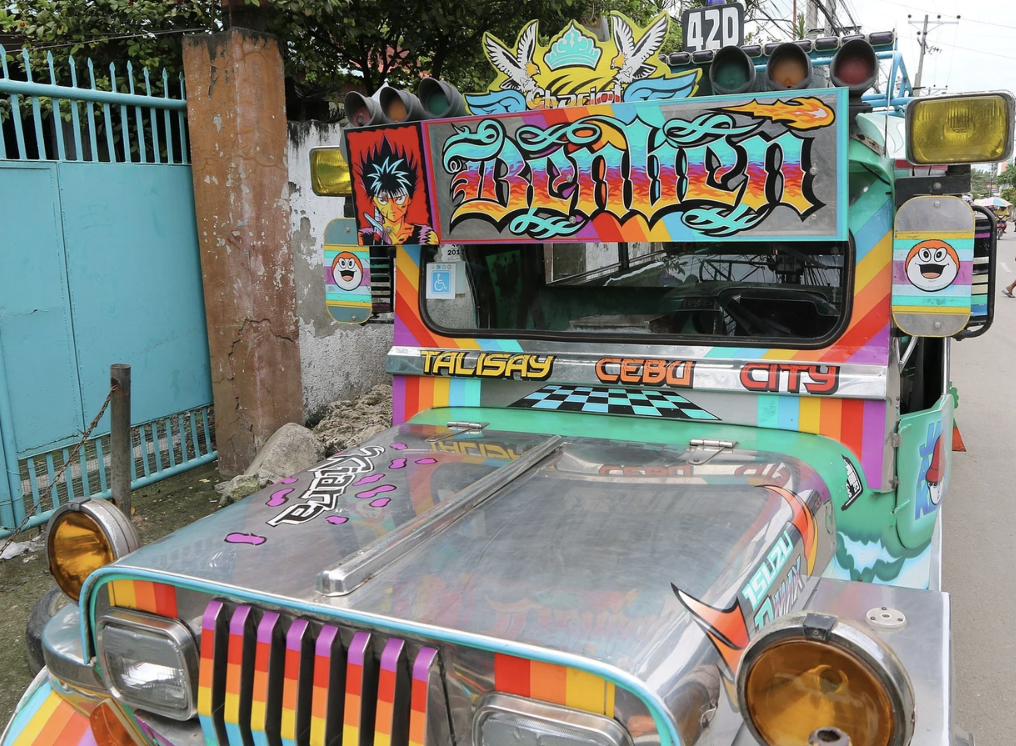
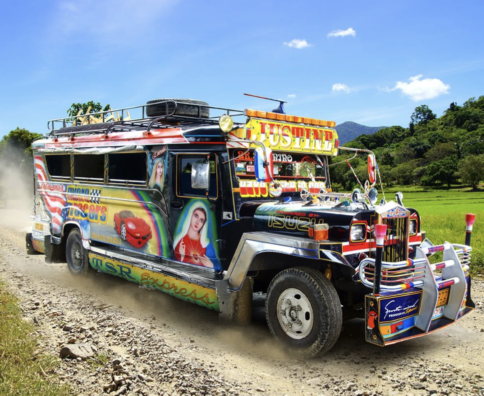
Jeepney typefaces are most certainly Filipino design, and a design that will keep evolving. It will survive because, under the surface, it has always been about resilience.
There is such a rich tradition in sign-painting and metal work, I have no doubts that it will continue to pass down to the generations. We keep the art form alive by respecting and supporting the sign-painters and the crafts-people behind the letterforms. We should not try to simply preserve the rich visual culture that we possess,
but further we must integrate those who have created that culture into our future.
WHAT MAKES THIS TYPEFACE TRULY FILIPINO?
I have to say this is a difficult question. I can feel what is Filipino, but how can I define it? I've tried to make connections and assertions, but I still think I have no concrete conclusions. Filipino style comes from so many places internally and externally. There are many lines to follow, such as the clear influence of Baybayin calligraphy, the use of lettering from Catholic iconography, the bond through colonial commerce with Mexico, the pop culture lexicon from US capitalism, the use of graffiti from Hip Hop, the fandom of JDM tuner cars and the effects of the early internet and cellphone language.
Rather than synthesizing these threads into a formalized definition, I find it interesting to follow each subject individually and leave the ends loose. In this way, the meaning of Filipino typography is evolving and malleable, which escapes becoming a stagnant troupe.
For me, it's about asking, "how is the typography Filipino?" 'How' makes us look into the conditions that created this graphic form and delve into characteristics that go beyond the visual, such as humor, language, emotion, or tonality.
It also brings in history, politics, war, economics, and
social struggle. I'm not the person to make conclusions
but asking 'how' brings my mind into different spaces
and is an infinite source of study.
WHAT WAS THE PROCESS OF DESIGNING THESE T-SHIRTS WITH CHRIS/TFI LIKE? WHAT’S THE STORY BEHIND IT?
The Tropical Gothic shirt for TFI comes from a love of Metal/Punk culture in the Philippines and Southeast Asia.
I grew up with this music and culture with my brother Kevin Henson who was in many punk bands in Los Angeles.
He had a deep record collection that exclusively focused on Crust Punk, Black Metal, Grindcore, Thrash,
Power Violence, and classic UK/Sweedish Hardcore.
He has his own reputation within the local scene in Manila as well. Even though I'm not as hardcore as he is, I'm still
a metal fan myself and decently versed in the genre.
I've always found the stylistic elements of metal;
darkness, horror, catharsis, mysticism, paganism,
anti-society themes, and political awareness, are the perfect counterpoint to the stereotypes of how we define the experience of the tropics. While the ritualistic ornamental style of Catholicism that is practiced in the Philippines resembles practices from the Gothic period, darkness and the supernatural exist in our folklore and from the trauma of surviving authoritarianism, so it would only make sense that there is a deep metal culture.
The graphic is an homage to Gothic typefaces that are usually deployed as band logos and used on cover art.
I warped the figures and exaggerated the serifs to be sharper and meaner looking. I tried to channel techniques
I used when I was young. Back then I used Xerox and pens because I did not have access to a computer to make designs or letters for flyers or album art. A graphic like this is not so much about the conceptual thinking I tend to do but just diving into form. I tried to let go, enter into a flow state, to customize these classic gothic letters into something out of hell.


The second graphic, Here & Now, was created in collaboration with Chris Fussner. Originally this was going to be the back of the Tropical Gothic shirt but instead became its own piece. It was a fun mix of text Chris had written, nautical metal looking graphics from Manila artist Zeus Bascon, and a diagram inspired by the Ram Dass book Be Here Now, a countercultural bible of sorts.
We wanted to create something that honored Ram Daas,
a very influential figure to us, by projecting positive intentions into the world. This was in 2019 … we had no idea of the tribulations and ordeals of 2020. If TFI is about a speculative future, this graphic fits what we need Now.

PHOTOS ABOVE (LEFT TO RIGHT)
- Entomb Narrow, type specimen for Library Paper, Kristian Henson, 2020
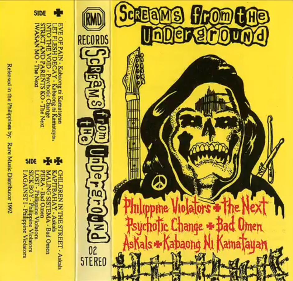
- Various Artists, Screams from the Underground, 1992
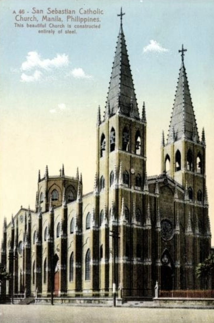
- The Minor Basilica of San Sebastian, 1891, An all-steel church built in the Gothic Revival style. Legend has it that Gustave Eiffel was involved in the engineering.
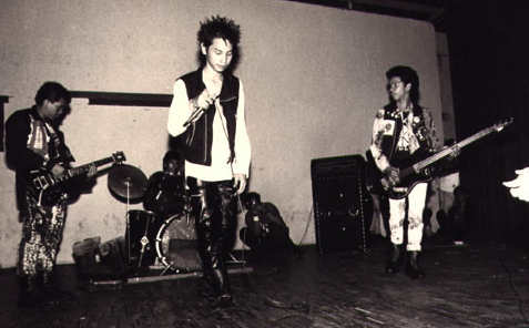
- Still from Philippine Punk History in Pictures, 2006. Source: kafkass on Youtube
- Deceased, self titled, Twisted Red Cross, 1988
- Death Vomit, 1995. Death metal band, Yogyakarta, Indonesia
WHERE TO NEXT?
ANY TAKE ON HOW VISUALS/GRAPHICS WILL MANIFEST IN 2021?
I'm actually in the process of moving to Manila! Really excited to start a new chapter with my wife, Monica Ramos. So much of my practice revolves around the Philippines and the Filipino diaspora, so why not be closer to it than to keep orbiting. I look forward to seeing how this move will shift my practice to Southeast Asia while staying connected to what I have in New York. There is an incredible creative community in the Philippines, and I'm excited to be one amongst many.
ANYTHING IN THE PIPELINE?
There are many projects in development that I can't fully spoil yet. Hardworking Goodlooking has some exciting projects and titles that are in progress. My studio has a few projects starting in the Philippines (fingers crossed).
I wish I could spill the beans but just be on the lookout
in 2021.
I think 2021 will be interesting because we've had so much to process from the pandemic's fallout (which is still ongoing). I'd like to think we all are rethinking our values and what matters. We have to recalibrate the way we work from scratch. I want to be an optimist and believe that we're not just going back to the way it was because
we were on breaking point even without the coronavirus.
How then can design reflect and give voice to a new pivot? I'm still processing what that will look like, but I can
already see people's references and styles changing to something more relaxed, more conscious, more mutual, and collective.
I'm saddened that many small businesses and institutions have closed since the pandemic, but other organizations
in the wake of George Floyd have arisen and what these more diverse companies do in the coming years is
very exciting.
The wake of so much devastation can only bring new life and new forms. Above all, let's honor those who have lost so much by supporting each other.
I also speculate that there might even be some kind of hedonistic backlash like seeing a carnival in the middle of the apocalypse. Maybe we’ll see a global version of the Weimar Republic or Shanghai during the roaring 20’s. Maybe Bladerunner really is now the present. A rise of people compensating from living in all the wreckage. People hoarding and living in the short term as opposed to cooperating and having a longer view. It's only natural. I think that it's an inevitable counterpoint and will bring its own movement with it.
We have a chance to reset the world in 2021;
anyone's guess is as good as mine.